Content
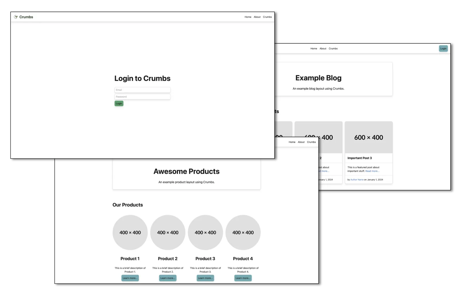
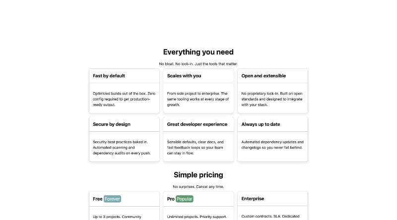
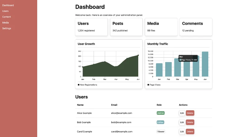
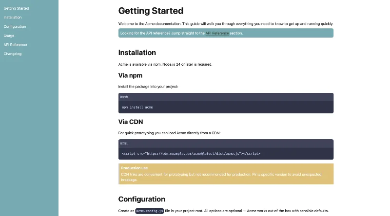
Crumbs provides a set of styles for common content elements to ensure consistency and readability across your application.
Code
Code snippets should be displayed using the code element.
Inline code
Ctrl + c
#!/bin/bash
echo "Hello, World!"
#!/bin/bash
echo "Hello, World!"#!/bin/bash
echo "Hello, World!"Links
Links are styled to be clearly distinguishable from surrounding text. Use descriptive link text so users understand the destination before clicking — especially when the link opens in a new tab.
<a href="#">Example link</a>
<a href="https://example.com" target="_blank" rel="noopener">Visit example.com</a>Lists
Crumbs provides styles for unordered lists, ordered lists, and definition lists.
Unordered List
Unordered lists are used to present items without a specific order.
<ul>
  <li>Item 1</li>
  <li>Item 2
    <ul>
      <li>Subitem 1</li>
      <li>Subitem 2</li>
    </ul>
  </li>
  <li>Item 3</li>
</ul>- Item 1
- Item 2
- Subitem 1
- Subitem 2
- Item 3
Ordered List
Ordered lists are used to present items in a specific sequence or ranking.
<ol>
  <li>Item 1</li>
  <li>Item 2
    <ol>
      <li>Subitem 1</li>
      <li>Subitem 2</li>
    </ol>
  </li>
  <li>Item 3</li>
</ol>- Item 1
- Item 2
- Subitem 1
- Subitem 2
- Item 3
Definition List
Definition lists are used to define terms and their corresponding descriptions.
<dl>
  <dt>Definition Term 1</dt>
  <dd>Definition Description 1</dd>
  <dt>Definition Term 2</dt>
  <dd>Definition Description 2</dd>
</dl>- Definition Term 1
- Definition Description 1
- Definition Term 2
- Definition Description 2
Quotes
Quotes are used to indicate the title of a work or a quotation from a source.
Inline Quotes
Inline quotes are used within a paragraph to highlight a specific phrase or sentence.
<p>This is an example of an inline quote: <q>This is a quote within a paragraph.</q></p>This is an example of an inline quote: This is a quote within a paragraph.
Block Quotes
Block quotes are used for longer quotations and are typically displayed as a separate block.
<blockquote>
  <p>This is a blockquote.</p>
</blockquote>
This is a blockquote.
<blockquote>
  <p>This is a blockquote with a citation.</p>
  <cite>- Author Name</cite>
</blockquote>
This is a blockquote with a citation.
- Author Name
<blockquote cite="https://example.com">
  <p>This is a blockquote with a source URL.</p>
</blockquote>
This is a blockquote with a source URL.
<blockquote cite="https://example.com">
  <p>This is a blockquote with a source URL and a citation.</p>
  <cite>- Author Name</cite>
</blockquote>
This is a blockquote with a source URL and a citation.
- Author Name
Tables
Crumbs styles all <table> elements automatically. Wrap any table in
<div class="table-scroll"> to enable horizontal scrolling on narrow
viewports — overflow-x on the table element itself has no effect due to
the table layout algorithm. Always add scope="col" to column headers and
a <caption> for accessibility. Row hover is built in — no extra
class needed.
Simple Table
<div class="table-scroll">
  <table>
    <caption>Team members</caption>
    <thead>
      <tr>
        <th scope="col">Name</th>
        <th scope="col">Department</th>
        <th scope="col">Status</th>
      </tr>
    </thead>
    <tbody>
      <tr>
        <td>Alice</td>
        <td>Engineering</td>
        <td>Active</td>
      </tr>
      ...
    </tbody>
  </table>
</div>| Name | Department | Status |
|---|---|---|
| Alice | Engineering | Active |
| Bob | Design | Active |
| Carol | Product | On leave |
Table with Header and Footer
<div class="table-scroll">
  <table>
    <caption>Quarterly results</caption>
    <thead>
      <tr>
        <th scope="col">Name</th>
        <th scope="col">Department</th>
        <th scope="col">Status</th>
      </tr>
    </thead>
    <tbody>
      ...
    </tbody>
    <tfoot>
      <tr>
        <td colspan="3">3 team members</td>
      </tr>
    </tfoot>
  </table>
</div>| Name | Department | Status |
|---|---|---|
| Alice | Engineering | Active |
| Bob | Design | Active |
| Carol | Product | On leave |
| 3 team members | ||
Colored Table
<div class="table-scroll">
  <table class="colored">
    ...
  </table>
</div>| Name | Department | Status |
|---|---|---|
| Alice | Engineering | Active |
| Bob | Design | Active |
| Carol | Product | On leave |
Bordered Table
<div class="table-scroll">
  <table class="bordered">
    ...
  </table>
</div>| Name | Department | Status |
|---|---|---|
| Alice | Engineering | Active |
| Bob | Design | Active |
| Carol | Product | On leave |
Lined Table
<div class="table-scroll">
  <table class="lined">
    ...
  </table>
</div>| Name | Department | Status |
|---|---|---|
| Alice | Engineering | Active |
| Bob | Design | Active |
| Carol | Product | On leave |
Images
Crumbs ships styles for images to make them responsive and visually appealing.
Responsive Images
By default, images are responsive and will scale to fit the width of their container.
<img src="https://placehold.co/1200x200/e0e0e0/000000.webp" alt="Example Image">
Rounded Images
Use the rounded class to apply rounded corners to an image.
<img class="rounded" src="https://placehold.co/900x200/e0e0e0/000000.webp" alt="Example Image">
Circle Images
Use the circle class to create circular images.
<img class="circle" src="https://placehold.co/200x200/e0e0e0/000000.webp" alt="Example Image">
Shadow Images
Use the shadow class from the utilities to add a shadow effect to an image.
<img class="shadow" src="https://placehold.co/200x200/e0e0e0/000000.webp" alt="Example Image">
<img class="circle shadow" src="https://placehold.co/200x200/e0e0e0/000000.webp" alt="Example Image">

Address
The <address> element retains its default italic styling.
Use <strong> for a name or company, and
<a href="mailto:"> / <a href="tel:">
for contact links — all display as block elements so each item sits on its
own line.
<address>
  <strong>Acme GmbH</strong>
  <a href="mailto:hello@example.com">hello@example.com</a>
  <a href="tel:+491234567890">+49 123 456 7890</a>
  123 Example Street, Berlin
</address>


Social Links
Use
.social-linkson a<ul>to display a compact row of brand and social profile links. Works inside.sidebar,.navbar, or any block container. Icons inherit color viafill="currentColor"— dark mode is handled automatically with no extra CSS.For brand icon sources, installation options, accessibility guidance, and a live example, see 3rd Party → Social Icons.