That's it! You can now start using Crumbs in your project. See the
User manual
for more options and advanced installations.
Description
Crumbs is a lightweight and minimal CSS framework designed to support the
development of applications for
Cozy Badger. In the spirit of Open
Source, Crumbs is freely available for use in your own projects. You are
also welcome to contribute to its development and improvement.
The framework focuses on providing a solid foundation for building modern
web interfaces, with an emphasis on simplicity, flexibility, and ease of
use. It includes a variety of pre-defined styles and components that can be
easily customized to fit the needs of your project.
Features
Lightweight and Minimal
Crumbs is designed to be lightweight and minimal, providing only
the essential styles and components needed for building web
interfaces.
Responsive Design
Crumbs includes a responsive grid system and
takes care of cross-browser compatibility to help you
create layouts that work on all screen sizes.
Customizable
Crumbs is built with Sass, making it easy to customize the
framework to fit your project's needs. You can easily override
variables and mixins to create your own styles.
Predefined Components
Crumbs includes a variety of pre-defined
components, such as buttons,
forms, and navigation menus, that can be easily customized and
integrated into your project.
Utility classes
Crumbs provides a range of utility classes
for common tasks such as spacing, typography, and colors, making
it easy to apply consistent styles throughout your project.
Open Source
Crumbs is an open-source project, allowing you to contribute to
its development and benefit from the contributions of others in
the community.
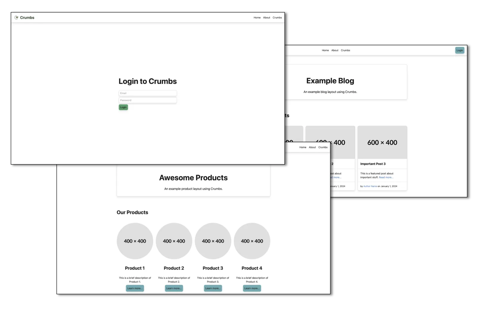
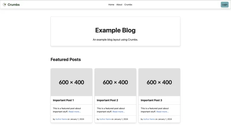
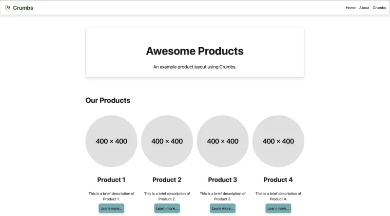
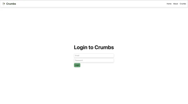
Examples
Explore some practical examples built with Crumbs to kickstart your projects.
Use these templates as a foundation and customize them to fit your needs or
as inspiration for your own designs.
The container class provides a responsive fixed width container that
adjusts its max-width at different breakpoints to ensure optimal readability across devices.
The container-fluid class provides a full-width container that spans the entire width of the viewport.
Grid
The grid layout allows for the creation of complex responsive layouts using a series of rows and columns.
Crumbs includes a variety of pre-designed components to help you build your UI quickly.
Alerts
Use alerts to provide feedback messages to users.
<div class="alert">This is a default alert.</div>
<div class="alert info">This is an info alert.</div>
<div class="alert success">This is a success alert.</div>
<div class="alert warning">This is a warning alert.</div>
<div class="alert danger">This is a danger alert.</div>
Callouts are used to highlight important information.
<div class="callout">
  <div class="callout-header">Callout Header</div>
  <div class="callout-body">This is the body of the callout.</div>
</div>
<div class="callout success">
  <div class="callout-header">Success Callout</div>
  <div class="callout-body">This is a success callout.</div>
</div>
<div class="callout info">
  <div class="callout-header">Info Callout</div>
  <div class="callout-body">This is an info callout.</div>
</div>
<div class="callout warning">
  <div class="callout-header">Warning Callout</div>
  <div class="callout-body">This is a warning callout.</div>
</div>
<div class="callout danger">
  <div class="callout-header">Danger Callout</div>
  <div class="callout-body">This is a danger callout.</div>
</div>
<div class="callout">
  <div class="callout-header"><span>⚠️</span>Callout with Icon</div>
  <div class="callout-body">This callout includes an icon.</div>
</div>
Callout Header
This is the body of the callout.
Success Callout
This is a success callout.
Info Callout
This is an info callout.
Warning Callout
This is a warning callout.
Danger Callout
This is a danger callout.
⚠️Callout with Icon
This callout includes an icon.
Cards
Cards are flexible content containers with multiple variants and options.
Basic Card
A simple card with a header and body.
<div class="card">
  <div class="card-header">
    Card Header
  </div>
  <div class="card-body">
    This is some text within a card body.
  </div>
</div>
Card Header
This is some text within a card body.
Card with Image
A card that includes an image at the top.
<div class="card">
  <img class="card-image" src="image.jpg" alt="Card Image">
  <div class="card-body">
    This is some text within a card body.
  </div>
</div>
This is some text within a card body.
You can place the image anywhere within the card.
<div class="card">
  $lt;div class="card-header">
    Card Header
  </div>
  <div class="card-body">
    This is some text within a card body.
  </div>
  <img class="card-image" src="image.jpg" alt="Card Image">
</div>
Card Header
This is some text within a card body.
All features Card
<div class="card">
  <img class="card-image" src="image.jpg" alt="Card Image">
  <div class="card-header">
    Card Header
  </div>
  <div class="card-body">
    This is some text within a card body.
  </div>
  <div class="card-footer">
    Card Footer
  </div>
</div>
Card Header
This is some text within a card body.
Cards in a Grid
You can use the grid system to layout multiple cards.
Apply color utilities to change the text and background colors of elements.
<div class="color-brand">Brand colored text</div>
<div class="color-light background-dark">Light colored text on dark background</div>
<div class="background-brand color-light">Brand background with light text</div>
Brand colored text
Light colored text on dark background
Brand background with light text
Shadows
Apply shadow utilities to add depth to your elements.
<div class="shadow-xs">Extra small shadow</div>
<div class="shadow-sm">Small shadow</div>
<div class="shadow-md">Element with shadow</div>
<div class="shadow-lg">Large shadow</div>
<div class="shadow-xl">Extra large shadow</div>
Extra small shadow
Small shadow
Element with shadow
Large shadow
Extra large shadow
Visibility
Control the visibility of elements using visibility utilities.
<div class="visible">This element is visible.</div>
<div class="hidden">This element is invisible.</div>
This element is visible.
This element is invisible.
Spacing
Use spacing utilities to manage the margin and padding of elements. You
can apply these utilities to all sides or specific sides of an element.
Note
Spacing values are based on a scale from
extra small (xs) to extra large (xl). Spacing directions include
top (t), right (r), bottom (b), left (l), horizontal (x), and
vertical (y). And spacing types include margin (m) and padding (p).
<div class="p-{size}">Element with padding on all sides</div>
<div class="m-{size}">Element with margin on all sides</div>
<div class="p{direction}-{size}">Element with padding on specific side(s)</div>
<div class="m{direction}-{size}">Element with margin on specific side(s)</div>
Examples:
<div class="p-xs">Element with padding 0.25rem</div>
<div class="p-sm">Element with padding 0.50rem</div>
<div class="p-md">Element with padding 1rem</div>
<div class="p-lg">Element with padding 1.5rem</div>
<div class="p-xl">Element with padding 2rem</div>

<div class="m-xs">Element with margin 0.25rem</div>
<div class="m-sm">Element with margin 0.50rem</div>
<div class="m-md">Element with margin 1rem</div>
<div class="m-lg">Element with margin 1.5rem</div>
<div class="m-xl">Element with margin 2rem</div>

<div class="pt-md">Element with padding-top 1rem</div>
<div class="pr-md">Element with padding-right 1rem</div>
<div class="pb-md">Element with padding-bottom 1rem</div>
<div class="pl-md">Element with padding-left 1rem</div>

<div class="px-md">Element with padding-left and padding-right 1rem</div>
<div class="py-md">Element with padding-top and padding-bottom 1rem</div>
Customization
Crumbs uses design tokens to define its core styles, including colors,
typography, spacing, and more. These tokens ensure consistency across
the framework and make it easy to customize the look and feel of your
application.
Color Tokens
Color tokens are used to define the primary, secondary, and neutral
colors of the framework. They can be easily customized to match your
brand colors by using CSS variables.
To ensure accessibility, make sure to choose colors that provide
sufficient contrast between text and background elements. Also test
the colors in both light and dark mode to ensure readability
in different environments.
Border Tokens
Border tokens define the border radius, style, width, and color used
throughout the framework. These can also be customized using CSS
variables.
Box shadow mixins help you add shadow effects to elements.
.element {
  @include box-shadow('sm');
}
Media Mixins
Crumbs comes with an automatic detection of the preferred dark mode
setting of the user's system. Therefore, some elements will change,
if the operating system is set to dark mode.